Author Thread
Post actions
This is a good idea, but it's kind of blurry. The light is also a tad too bright.
Comments Made During the Challenge
Post actions
For some reason, the lighting on this looks too harsh, almost like a direct flash. Try bouncing it off of some white foam board.
Post actions
Post actions
White seems to have shadow. Fuzzy overall.
Post actions
Subject Impact: Low
Post actions
seems oversaturated (white areas show artifacts). composition ok.
Post actions
I would like this better if everything was sharp. It could really help.
Post actions
Post actions
Interesting composition, but just too blurry.
Post actions
The focus is just a little bit soft. Your colors are vibrant though. This is a shot you might want to try again but using a tripod.
Post actions
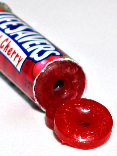
i like the sharpness.. makes the sweets look tasty.. wld be nicer if e sweets were laid out more naturally
Post actions
I know that it's hard to do on the shot - but I think the shot would work better if the entire package was in focus. The focal point (for me atleast) is the lifesavers lettering.. I think because it's the starkest contrast in the shot, but the focal point is slightly deeper than the focus.





 Add photograph to your favorites
 Add photographer to your favorites

 Photographer found comment helpful.


