|
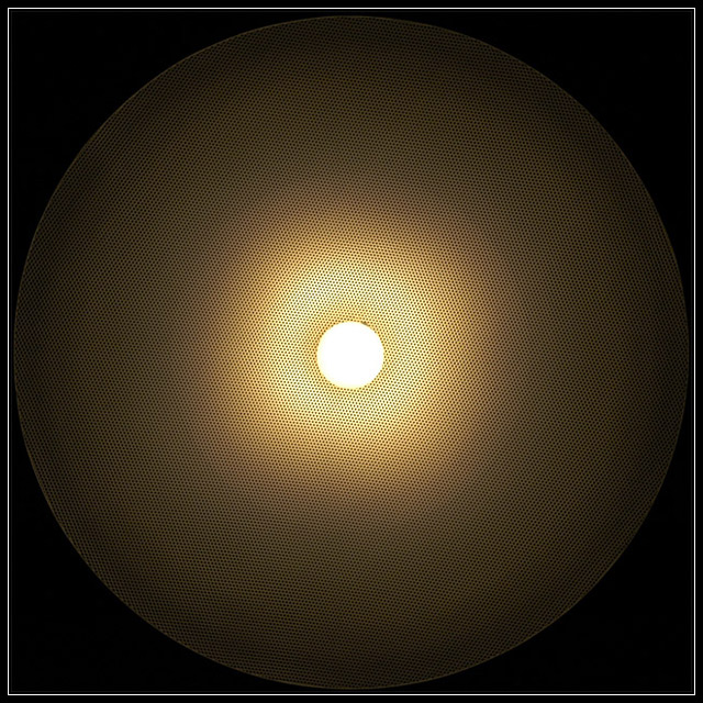
I don't know what this is, but I like the graphic design. The gradient is very pleasing to look at and your attention to detail in the symmetry is evident. My only nit (an this doesn't affect score at all) is the little dark spot at 1:o-clock. Since the placement of the white center pulls the eye right to it, the spot gets immediate attention. |







 Add photograph to your favorites
 Add photographer to your favorites


 Photographer found comment helpful.

