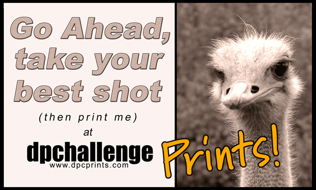
Congratulations on getting first place. The design itself is great with all the colors matching well and the text is very nice. The "slogan" could be changed and there are some great ideas to improve on this below. Great job!
This is one of my favorites! I love the picture. The only criticism I have is that I'd like the main text to be a little different. I think it should say "Go ahead, take your best shot (then print it) at ...," plus the main text coudl be a different color, maybe closer to the "Prints!" color. Very nice.
Covers the info pretty well, exotic subject attracts attention. Seems more targeted towards attracting photographers than print-buying customers, which is a somewhat different slant than most.
I really like the message here - think it's cute, clever and tells what the site is about. I'd prefer a slightly different balance between the photo space and the text space. I think this would work best as a promotional postcard.
7, Kavey
Nice choice of colour on the font, which goes well with the sepia photo. That really makes the 'Prints!' stand out nicely. I like the (then print me) but I think that you could do without the word 'at'. I think it kinda spoils the flow of the text. I also think that because you have included a comma in the slogan, you should alsp punctuate it at the end with a !





 Go ahead, take your best shot ...
 Add photograph to your favorites
 Add photographer to your favorites

 Photographer found comment helpful.


