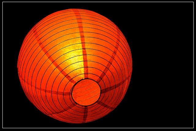
Last minute shot after thinking for a whole week. Sometimes you just go to look up for ideas.... and there this was my lamp on the cealing. The circular shade looked like a brilliant entry for this challenge.
Statistics
Place: 90 out of 545 Avg (all users): 5.5681 Avg (commenters): 6.7500 Avg (participants): 5.4890 Avg (non-participants): 5.6891 Views since voting: 1043 Views during voting: 383 Votes: 301 Comments: 16 Favorites: 0
For this contest everyone who has the word “circle” in their title is getting a max 10 score. This is a copy and paste version that I am including in every photo that I upgrade to 10 due to the title. We as members of DPchallenge need to be reminded of the topic of the challenge – we really need to reread the topic every time we reach a photo. If circle is in the title and it is appropriate I will give a 10. I am sorry if you do not agree with my method of voting – but scores are all I have.
Howdy. This definately fits the circle theme, but if you have the word circle in your title...you get a 1. LOL Just kidding. I really like the color of this lighting fixture. The oranges and reds and yellows really go together to give this a nice flowing appearance. I like how you have placed your subject off center. That also creates some visual appeal.
The focus and clarity are really good and the image is overally nice to look at. The background works for me, and there is nothing distracting there.
I like the way the 'circles' around the lamp are really a 'spiral' and not actual circles at all, but our eyes believe that they are.
My only real suggestion would be to try to eliminate the speckles around the yellow lit part. It's not a huge deal, but does take away from the overall first impression of 'perfect'. Still very nice. ~Heather~
For this contest everyone who has the word “circle” in their title is getting a lower score. This is a copy and paste version that I am including in every photo that I downgrade due to the title. We as members of DPchallenge know the topic of the challenge – we do not need to reread the topic every time we reach a photo. If circle is in the title and it is appropriate I will most likely not down grade, but it better be good. I am sorry if you do not agree with my method of protest – but scores are all I have.
Love the bold color and contrast ... nice detail in the lantern or whatever that is ... I personally do not like the excessive blank space to the right I think it pulls away from the subject and doesn't add to the total composition but, I may be a bit more symetrical than most.
colours look very heavily saturated (starting to get blown out) and contrast v high. Noice image, thoughg - just a biot of a shame about the technicals.







 Add photograph to your favorites
 Add photographer to your favorites

 Photographer found comment helpful.


