We all know what the challenge title is. It is too bad that you could not take the time to be more creative with your titleing.
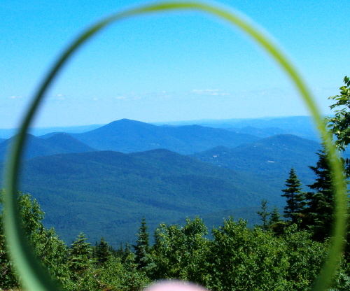
nice comp, nice color, nice dof, object on bottom of fg is distracting and out of place, some artifacting around circle, blacks ok, whites need work, overall ho hum
For this contest everyone who has the word “circle” in their title is getting a lower score. This is a copy and paste version that I am including in every photo that I downgrade due to the title. We as members of DPchallenge know the topic of the challenge – we do not need to reread the topic every time we reach a photo. If circle is in the title and it is appropriate I will most likely not down grade, but it better be good. I am sorry if you do not agree with my method of protest – but scores are all I have.
Too much a view through a fuzzy, out of focus major segment of a circle. I'm sure the view was spectacular but it hasn't been recreated here with too much sky and far distance. Getting the horizon line higher in the pic would help.
very unique idea. I would suggest cropping just enough off the bottom to remove the bright blurry object near the center bottom. Without that distraction there, the eyes look at the rest of the image, as opposed to being drawn to that bright thing at the bottom.






 Add photograph to your favorites
 Add photographer to your favorites


 Photographer found comment helpful.