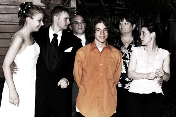
That is a great family photograph. I'd love to know what this guy has just said (or done) to earn this 80% disapproval rating from the other family members. Whatever it was, he's marvellously unrepentant. He doesn't even care about the selective desaturation (and nor do I). Terrific work. 8
Fit Competition Criteria: 2/2
Contrast/Color: 0/2
Photo Quality: 1/2
Composition: 2/2
My Subjective Affinity: 0/2
The selective desaturation doesn't add anything to the photo. The face of the father figure in the back is too dark. The white shirts are too, too bright.
Interesting use of desat to draw attention to your main character in the image. It is unclear what people are looking at but it does not appear to be the boy. Fits the challenge.
The white dress and blouse are overexposed and should be burned to try to get more detail. Horizon needs to be level. This wrong horizon shows up three distinct ways. One is the people all appear to lean to the right. A second is the apper to get shorter moving from left to right. and lastly the background wall shows a strong downward right tilt.
Excellent capture showing family dynamics. Good use of selective desat. Only thing I can see to pick on here is the slightly blown whites. Love that the 'center' is oblivious to everything else. 8 good luck in the challenge!
Tell me about it. The expression on the figure on the left is out of place for me in this composition. I don't know, the image gets me to thinking. Is it meant to show the variety of feelings of the characters toward the main character. Is there supposed to be a special bond between the subject on the left and the character? How do you interpret it?







 Add photograph to your favorites
 Add photographer to your favorites


 Photographer found comment helpful.


