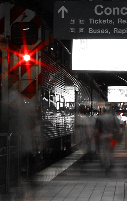
Composition - Although I don't think this was one of the best images of the challenge, it was one of my favorites. I think this is a great idea. I do however like relatively long exposure stuff. The dark desaturated tone of this image is really fitting for the theme. The people's "ghosts" walking about are very well done. Their figures are detectable, but still pretty transparent. The red light on the top is really a nice touch of color for this image. This is a very well composed pic. I think I made my point about the signs in my comment so I won't bore you with the same stuff again.
Technical - This was masterful in terms of having just the right amount of exposure. Unfortunate side affect of this is the "white" signs are way overexposed. I'm not sure if they are really white or just way overexposed. Hard to tell. This is really well framed too with the people generally central to the photo, the train to one side. I wish I would've thought of this. This is very well done.
Overall - Like I said, this was one of my fav's for this challenge. You did a great job with it. I think you would've added a half point or maybe more if you could've toned down those signs or faded them out all together. But I don't mean to belabor the point, but you did a fantastic job taking this. Congrats on a good shot and good luck - BoB
Good concept and well executed. The one thing that really brings this down is the white part under the sign closest the camera. The ones in the background aren't quite so big nor bright. The one in front though is more than a little distracting. The red light is very cool looking the way that was captured.
This would be a winner if it wasn`t for the very distracting top white screen. I think i would have cropped it right out even though you would have lost the red light. 8
What are the white things? What is the red light? This pic is a bit too dark to make out. I like your ghostly people, though. that's a really neat effect.
This is really good ... the desaturation is almost perfect ... the red looks nice. Not sure what the big white objects are ... TV screens perhaps? Looks almost impossible to have kept those from being overexposed given the exposure time it appears you used. Nice job... one of my favs this week
I think this shows transportation on two different levels very nicely. Well chosen subject. Pity about the signs. Might be slightly better if you crop off the top so that none of the signs show or even just to the top of the bottom TV/Sign, even though it does lose a lot of the train.





 Add photograph to your favorites
 Add photographer to your favorites

 Photographer found comment helpful.


