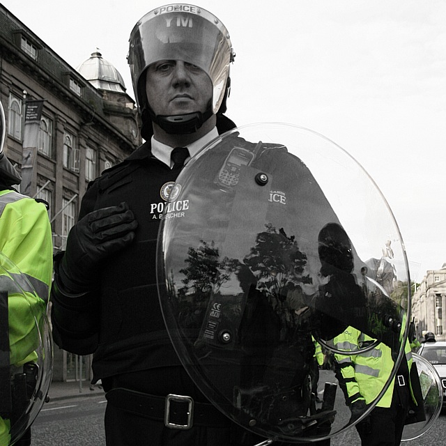
Shot at today's protests in Edinburgh, while shooting i found myself on the wrong side of the riot shields, but i still remembered the current challenge :)
Desaturated all colours but dayglo yellow (left yellow at 50%, green at 100%). No funny history brush selection stuff done or anything like that, because of basic editing, which is why the building in the background on the right is still coloured in. The composition is a little busier than i'd have liked but this came out the best of what i took, so here it is :)
Statistics
Place: 84 out of 545 Avg (all users): 5.6128 Avg (commenters): 7.1250 Avg (participants): 5.6077 Avg (non-participants): 5.6207 Views since voting: 1017 Views during voting: 428 Votes: 297 Comments: 29 Favorites: 1 (view)
I really like this image...very aggresive feel about it...looks like the cop is about to reach out and slap the viewer...the perspective heightens this sensation authority / power...what I'm not seeing is the "circle" as a key element...I appreciate this "out of the box" ( Jeesh I hate that term ) concept..but with sooooo many entries...I really have to keep the challenge description in mind. Still a really excellent image though...thought provoking indeed.
I keep coming back to this image...perhaps I was wrong with some of my previous statements...Marking this way up...to powerful an image not to.
For this contest everyone who has the word “circle” in their title is getting a max 10 score. This is a copy and paste version that I am including in every photo that I upgrade to 10 due to the title. We as members of DPchallenge need to be reminded of the topic of the challenge – we really need to reread the topic every time we reach a photo. If circle is in the title and it is appropriate I will give a 10. I am sorry if you do not agree with my method of voting – but scores are all I have.
Good title but read on for my thoughts on titles(no downgrade for you) -For this contest everyone who has the word “circle” in their title is getting a lower score. This is a copy and paste version that I am including in every photo that I downgrade due to the title. We as members of DPchallenge know the topic of the challenge – we do not need to reread the topic every time we reach a photo. If circle is in the title and it is appropriate I will most likely not down grade, but it better be good. I am sorry if you do not agree with my method of protest – but scores are all I have.
i really like this shot: the glass circular shield, the policeman's expression, how his shield is covering part of his face. but I really dislike the selective desaturation. I find the green jackets incredibly distracting in the photo. 6
I would have liked to see this in B&W with just the neon yellow slickers back in color....this almost looks that way until you look closer at the buildings, especially the one in the right background. Nice entry for the challenge.
topical! Not sure that the selective desat works that well here - face tones look all wrong. Also, he has dropped his baton (but is still holding his hand as if he has one!).
Why did you choose to selectively desaturate and create eye catching pieces of this image that pull the viewer away from the subject? This is an all too common method I see around here and I simply can't understand why people choose to do it.






 Add photograph to your favorites
 Add photographer to your favorites

 Photographer found comment helpful.


