Thank you for the helpful comments and beneficial feedback.
For the record, the first time I saw another 'ant' picture was in this challenge (although surprised to see it ('Social Circle'), for me it was still a different concept). I conceded then my idea wasn't as original as I thought. When I saw "..i saw the same shot on..", I thought that I was going to see MY photo at that link. The referred photo I saw was indeed similar to my 'pre-pp' image, but it was the first time I had ever seen it. It was also the first time I ever saw the original to THAT photo (read the comments there if you are interested).
I concede the idea is not that novel now, but I did before that delusion was shattered ":)". All part of the 'learning'.
Here are some of the 'finalists' for my entry. My better half (who it seems was right, as usual) preferred the sharper angle, but I wanted to ensure it looked like a CIRCLE.
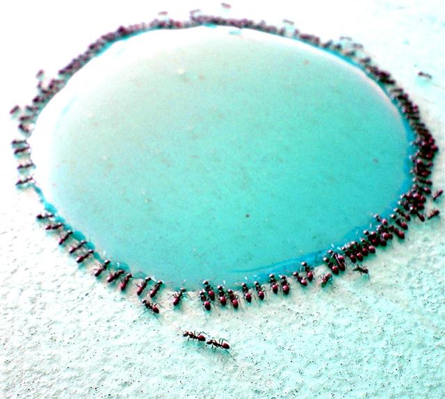
I chose the one I did because I liked the angle best and I liked how the ants out of focus created a 'blurred border'. I also liked the two ants in the foreground. For me 'the subject' was the actual circle, not the ants.
For this contest everyone who has the word “circle” in their title is getting a lower score. This is a copy and paste version that I am including in every photo that I downgrade due to the title. We as members of DPchallenge know the topic of the challenge – we do not need to reread the topic every time we reach a photo. If circle is in the title and it is appropriate I will most likely not down grade, but it better be good. I am sorry if you do not agree with my method of protest – but scores are all I have.
This could have been great with a smaller aperature. As it is, only the two closest ants are in focus, and those don't seem all that in focus. I like the idea. I have seen a similar ant shot already, but I think I like this one better. May come back to this later. Well done.
Content fascinating. Over exposed leading to loss of highlight detail in top areas of frame. This is one case where I think I'd prefer more depth of field.
I like the content, but it seems to lose is with the lack of focus at the far end. Also a little to much glare distracts from the main body of the picture.






 Add photograph to your favorites
 Add photographer to your favorites

 Photographer found comment helpful.


