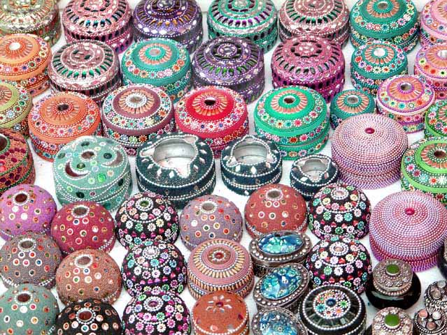
Circle Overload! The plain white background is overpowering - the )( shapes stand out - and there's no sense of creativity in the arrangement. The picture is very busy, which is somewhat distracting. Having fewer elements in a more interesting arrangement would have gained bonus points!
As it stands, a nice texture shot.
For this contest everyone who has the word “circle” in their title is getting a lower score. This is a copy and paste version that I am including in every photo that I downgrade due to the title. We as members of DPchallenge know the topic of the challenge – we do not need to reread the topic every time we reach a photo. If circle is in the title and it is appropriate I will most likely not down grade, but it better be good. I am sorry if you do not agree with my method of protest – but scores are all I have.
You've definitely met the challenge and found a circle, or two, or a bunch :) I think there are to many circles to make this composition effective for me though. It's busy to me and that detracts from it's attractiveness. - 5 - JeB






 Add photograph to your favorites
 Add photographer to your favorites


 Photographer found comment helpful.


