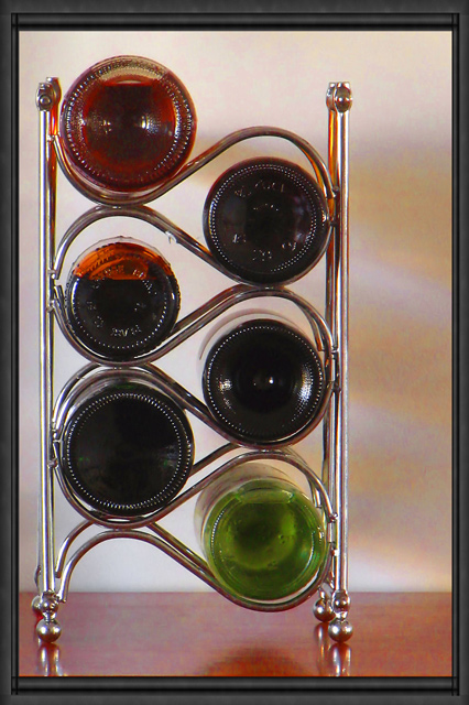
The shadow bottom centre is slightly distracting. The only thing I can think of that would increase the interest in this shot would be to cast more colour onto the wall behind, possibly by using a very strong point light source.
I don't understand the title at all. for some reason this seems to lean a bit to the right. the frame is overly complex. other than that I like this quite a bit. colourful and original. good luck. /7
Very nice. I like the way you set this up. I think that it works really well to the left of the photo, not dead center. Lighting is good, focus is ok, seems a little soft on the bottles, but I think that's just the bottles themselves, sometimes glass does that. My only real suggestion would be to find 2 other bottles that had solid bottoms. The top 2 that are on the left side are partially empty and you can see that in the photos. Not really a big deal, but makes it seem less uniform. I like the background and you did a very nice job of levelling your 'horizon' line. Visually appealing image. One of my top picks so far. ~Heather~
this is a GREAT idea but i think it could have been implemented better. the background should be seamless, and i would like to see a composition where all the bottles are the same or just one is different to give the shot a focal point. also, the border doesn't really do anything for me.
Someone has been drinking your wine!... Lovely composition would have been over the moon if you hand managed to compose it with out the wooden base but thats me... nice
Interesting shot. I wonder how it would look without being so straight-on, maybe more of an angle to reduce the reflections? This could be a photo worth playing with!






 Add photograph to your favorites
 Add photographer to your favorites


 Photographer found comment helpful.


