|
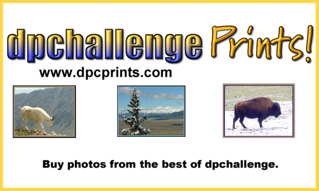
The first thing that hits me when looking at this is that the images aren't centered. The second thing is the colouring in the 'dpchallenge'. I've never been a fan of mixing yellow and blue, which is just a personal preference. I think the bevel on the 'Prints!' looks pretty good, but on dpchallenge it just doesnt work as well. I think for bevel to look good it needs the right font. |






 Add photograph to your favorites
 Add photographer to your favorites


