Author Thread
Post actions
Comments Made During the Challenge
Post actions
Post actions
This is fantastic, you sure put a lot of work into this. And it has paid off - 10.
Post actions
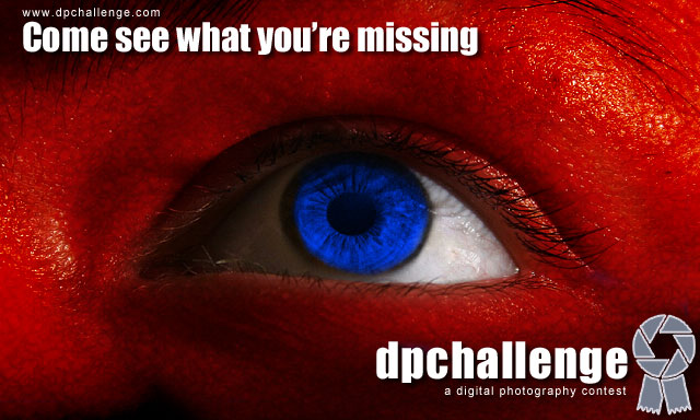
I rated pretty high, but the red skin seems a little distracting, wonder how it would have looked in B&W skin tones, with blue and white eye.
Post actions
Colors make this very dramatic. Nice. Verbal play is enticing. 10.
Post actions
Interesting and enticing.
Post actions
I like this idea but IMO the red is a bit too strong.
Post actions
The color of the face appears as if there's a bad sunburn (Hard to look at)
Post actions
A little "scary" image, makes you curious, I like it - 8
Post actions
Like the idea a lot and the layout of the text and logo.
Post actions
Have you been into the Vitamin B12 again?
Post actions
i don't think this photo exhibits the 'style' of photography that is generally legal in a challenge...
Post actions
good work and composition
Post actions
The red skin is a bit too much.
Post actions
I like it but I would have like to the www at the bottom leaving the Slogan by itself
Post actions
Nice and attention-grabbing. My early favorite for a winner. I would like to see the url slightly larger in a printed version.




 Add photograph to your favorites
 Add photographer to your favorites


