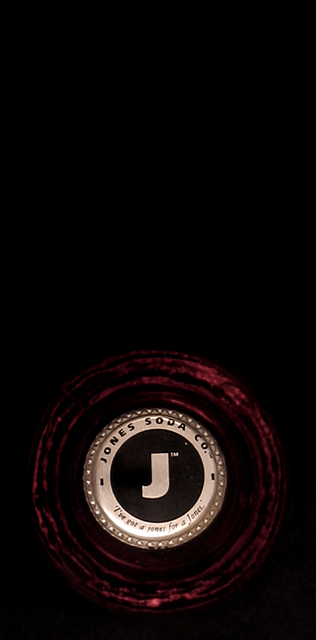
First thing I notice is the crop. I don't prefer it. The red bottle really isn't adding anything to the photo due to focus and lack of clarity, so I'm wondering if you were to take a photo of just the cap, if that would work better? Focus appears good on the cap. Lighting is a bit harsh on the bottom part of the cap. Hard to read the words there due to light reflection. The negative space seem awkward to me as well. I'm thinking this might work better with a square crop with the cap in one corner. Idea is neat though and definately circle. ~Heather~






 Add photograph to your favorites
 Add photographer to your favorites


 Photographer found comment helpful.


