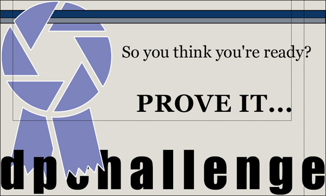
Nice design overall. I wish I could see more of the C, but I like the over/under effect you have going on. I think it would look just as good without the two dotted lines - though they add character.
Nice layout and simple colour scheme.
Main dislike is the thin lines which create a rectangle towards the top and a line down at the right.
I'd prefer only the thick horizontal lines across the top.
7, Kavey
there's no url here, in addition to the C being covered up.. making this sticker really only effective for people who already know what dpchallenge is and what the site address is. That's too bad, because this is a nice simple design.







 Add photograph to your favorites
 Add photographer to your favorites


