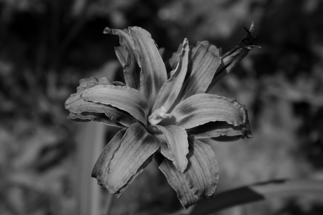
It looks like everyone hated the B&W... I agree it could have been better with more contrast, and I actually worked with it a little after it was suggested, and it does look much nicer that way.
As far as why B&W, since I was expecting 200+ flowers (as my title sugggests), I decided to do something that I was confident no one else would do.
I like this very much...lilies have such a plush texture....but ...I think the contrast needs some work..there are no real whites in this image to add any kind of pop or depth...it's a bit "flat"...you don't need much white...just some highlights here and there, but I think it would make a hige difference in the end.
I like the dark processing here, but I am a bit odd. Honestly, I wonder about the choice of processing since it isn't something you would normally see in a flower shot - I mean it's harsh, contrasty, and black&white. Certainly a bold choice. As far as cropping goes, I think a closer cut would be nice, so as to eliminate some of the extra space on the sides. For the most part, I do like this shot, despite my grumblings. Good luck in the challenge and happy shooting.
The tones of the B&W are great but the flower in front lacks a bit of exposure to properly pop out. Some weak macro flash might have worked very well here.
Hey, I like your title. Nice that you chose black and white for this, I just think this treatment is a little dull and lacking punch. Nice original thinking though
Nice title... and you're right... I think this is number 203. Very nice framing but I'm not sure the use of black and white doesn't actually take away from what this image could be. Nice subject.
While I think the B&W looks kinda neat, there' s not enough separation in focusing for the flower to stand out from the background. It all kind of blends together.
I counted 70 flower shots (not counting the ones with bugs) in this challenge. This one, I would have scored it higher if it would have been in color. Doesn't make for a very interesting B&W. The texture makes it look silk. Subject is very centered in the frame. Nice focus, though.
I think that the composition would be stronger if the flower were less central. Also, because there isn't a whole lot of contrast in the image, it would probably look better in colour, since in black and white, its tonal range is a bit too limited to be really effective.






 Add photograph to your favorites
 Add photographer to your favorites


 Photographer found comment helpful.


