Author Thread
Post actions
Excellent design! Congrats on the win, I think it would make a nice sticker indeed!
Post actions
Congratulations on yet another ribbon to your growing collection!
Post actions
I voted a 10 for this..... Nice Job.
Post actions
yeah! this was my favorite! congrats!
Post actions
well done .... on yet another ribbon :-)
Post actions
Great work. I hoped this one would win.
Post actions
This is a great idea and am glad to see it on top. I do think the text needs a little help though. Always ways to improve. Congratulations!
Comments Made During the Challenge
Post actions
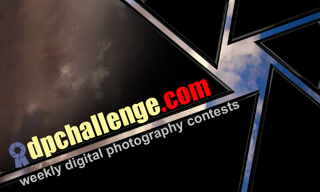
That's really cool, but it might've been better if you could see a little of the sky through all of it?
Post actions
I like how this gives a message visually rather than spelling it out.
Post actions
Post actions
Simple, stylish, informative.
Post actions
Wow..very dramatic and imaginative..excellent composition..looks like the openning of a lens out into the world.(10)
Post actions
Excellent shot. The shutter effect ties perfectly to the website, the sky is an effective backdrop. The design is eye catching and simple, and gives all the necessary information. 10
Post actions
Post actions
are the clouds ment to be visible through the shutter in the top left section?
Post actions
Pretty good idea using a mechanical apprature. I also like the placement of the URL and logo.
Post actions
Post actions
I don't like the colors of the text, but the design is cool.
Post actions
Very nice design; simple and straightforward. Clouds add some nice interest. --9
Post actions
great job - simple design - you told me all I needed to know - 10
Post actions
7. NIce idea, nice composition. Not keen on colours of text for dpchallenge.com.
Post actions
Post actions
Very nice concept. I especially like the aperture effect looking at the clouds. It's a nice play on the ribbon itself. Great color and clarity!
Post actions
I really like the overall design of this... I don't particularly like the text under the logo but i think some rearrangement on that would work very well... great idea :)
Post actions
This is the winner in my book! My favorite, great job!
Post actions
Very nice! You took a concept and ran with it! Drama, clarity, simplicity. Finally!
Post actions
One of my 3 favorites, great use of the aperture logo (I think thats what the pinwheel looking thing is...)





 sticker project 1c
 Add photograph to your favorites
 Add photographer to your favorites


 Photographer found comment helpful.


