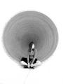
...a beautiful presence...the soft B & W tonality is very pleasing...but for me...the "squares" are getting much more attention than the circles...perhaps a different crop to just the window with the fan would change that? ...and that little white ghost in the bottom left of the right window, sometimes basic editing rules really suck...still a lovely image : }
I really like this! great composition and the b/w works teal well.the bright spot lower center is mild distraction, but this is a great image! bumping way up.
I really like this shot a lot, but it's hard for me to say why. It almost looks like a before & after shot from a magazine. I think the tonal quality, the contrast, and detail all make this a good shot for me.
i like the composition, it creates a competition between the circle of the fan and the squares of the window pane. Toning and lighting is also great. 0
love this picture, the colours are fab and the fan is a great idea. Only thing I would change is the white flash light? to the right of the middle of the pic. but it was basic editing huh? 7







 Add photograph to your favorites
 Add photographer to your favorites

 Photographer found comment helpful.


