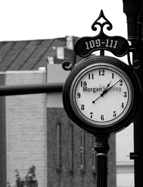
I think the background hurts this shot. If it were just the building it might not be an issue, but the black pole(?) that is running horizontally through the background is a distraction and the fact that it runs right through the clock adds insult to injury so to speak. See the top of the clock? It kind of blends in with the top of the building. The white sky doesn't bug me, actually, I think it looks nice with the black clock in front of it. Lighting seems very good on the subject. Nothing distracting there. Focus and clarity on the subject are just awesome. Too bad you couldn't get the same lighting effect at 9:15 or 3:45 so that the hands weren't running right through the words, but that's minor. Overall really nice, but wish it could have a different background. Hey, You could always take a huge white backdrop there and have someone hold it behind the clock while you take pics. :) ~Heather~






 Add photograph to your favorites
 Add photographer to your favorites


 Photographer found comment helpful.


