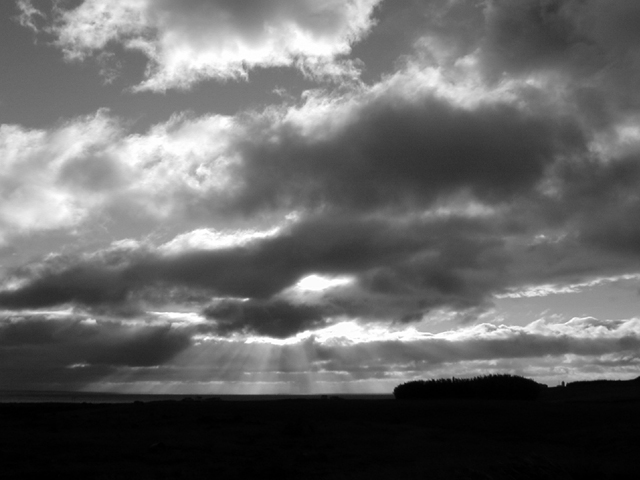
I love the contrast between the ground and the sky, but I wish it were emphasized a little more -- i.e. have more of that dark, anchoring ground at the bottom.
More zoom to capitalize on the great rays of sunlight a little better would improve the image. Cropping out the right side just where the trees begin makes a very strong vertical composition that follows the light from the bright cloud down through the dark, where it breaks through to the ground.
Great sky, but I wish there was some element that pulled the picture together and gave it a focus. A silhouette of something in there would have helped. I still rate it high though.
I shoot a lot of photos in this vein -- nice job! I like you caught those sunbeams in the left-center, and there's a lot of nice texture in the dark clouds (especially considering he limitations of DPC!).
If this had a flat or more interesting horizon it'd get a 10. The "lump" on the right causes just enough distraction to take the edge off for me. Seems to make the image just a little too right heavy. NIce tonal range in the clouds, ski and light "rays". This is also a good example to illustrate that the horizon does not have to be at a third.
I like it when the sun rays shine through the clouds that way. Having said that, I think that works better in color. There's not enough here to hold my interest, unfortunately.






 Add photograph to your favorites
 Add photographer to your favorites


