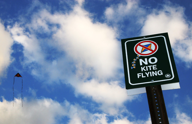
This is a shot of the latest sign the Parks Department has put up in Brooklyn, NY. This has been a legal battle since 1997. The area in question is close to a highway. Parks department says it causes accidents and traffic jams when people look up. However, this was orginally designated a kite flying field for 35 plus years and in that time, not one accident has been recorded, and traffic has yet to slow down in this area.
In 1997 they put signs up, but through the years the signs get taken down or destroyed. The last several years have been quiet, but recently the parks department has started harassing people once again.
Statistics
Place: 298 out of 545 Avg (all users): 4.8653 Avg (commenters): 5.9286 Avg (participants): 4.7022 Avg (non-participants): 5.1092 Views since voting: 904 Views during voting: 413 Votes: 297 Comments: 17 Favorites: 0
I think it would be better if the two subjects were not in a direct line. Example, the sign being a little lower then center and the kite being above center. Maybe portrait orientation also so the kite is much higher then the sign?
The first shape I see when this photo opens is a huge square. Even in the thumbnail, All I see is that dark square on the bright background. I think the 'main subject' here is the sign (not the objects on it), which, is actually square. (techncially rectangle, but square is easier to type. lol). That being said...beautiful image. Nice humor and technically very well done. Nice focus, great lighting and the background just adds to the image in all ways. The image is visually appealing and I like your choice of angle and framing/cropping. I like how the sign is off to the right and the kite is off to the left. My only wish for the photo is if the kite had been larger in the image, which would probably only be achieved by flying your own kite a bit closer to the sign. Otherwise, a great image, but maybe not the clearest interpretation of the challenge. ~Heather~
I have a feeling that the voters aren't going to pay attention to your circle as much as they should... a big circle saying NO lol... I love the irony of the shot. The saturation of the sky, and the contrast of the white clouds and black sign work very well. - 8 - JeB






 Add photograph to your favorites
 Add photographer to your favorites


