FIRST IMPRESSION: A bit confusing, took me a little while to get it, but worth the effort.
CHALLENGE: Meets the challenge.
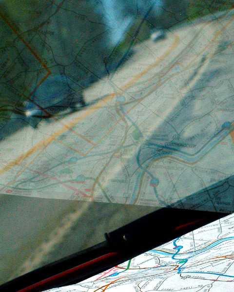
COMPOSITION: I think the composition of this shot is excellent. I like the angle you took it at. If you had excluded the map, the shot would have bee too confusing; included any more of it and it would have been boring. This is just enough to provide context. The reflection overlaying the shot of the road in the background
TECHNICAL: Exposure, depth of field and color are all appropriate.
CONCLUSION: An excellent shot, and it's a shame this didn't score better. Unfortinately I think the main thing that hurt your score is the fact that the viewer needs to look at this for a good bit of time to fully understand it, and many voters do not take that kind of time when voting. I personally feel this is an excellent shot that deserved to place much higher.
Thanks for sharing and good luck in future challenges!
I like the idea of the reflection of the map though the actual map in the bottom right is distracting since it is quite bright. To improve on this you could try cropping out more of the map from the bottom or using depth of field to blur the foreground.
Very creative approach to the challenge! Congratulations on not making the window too obvious. The heavy grain seems a bit overpowering, in my opinion.
a very creative idea! A map reflected with the country it represents.. perhaps a non-tinted window would really have given vibrance to your idea. I notice too that its a bit grainy which can often add a lot of character to a picture, but I'm not too sure it achieves anything great for me here. Good luck in the challenge! :)






 Add photograph to your favorites
 Add photographer to your favorites


