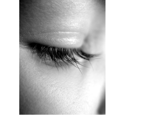
I don't like this border at all. It looks more like the site isn't displaying the full image than a border. It's completely distracting and detracts from what might otherwise have been a good image.
hmmm, i'm not quite sure how i feel about this border.
a little more focus on the lashes would help this image, considering most of them are out of focus. either way, i hope you do well, good luck
I really like this shot, but I don't like the border (I guess that's what it is) around it. Great detail on the lashes, nice soft lighting and good cropping.
I guess you are probably already getting lots of gruff about the uneven border. Your close-up is nicely done and well focused. The lashes, however, are a little unruly. A little spit on the fingers could shape them up nicely.
your border treatment had me take a longer look so it did its job of drawing attention to the shot... vignetting balances the composition... like the imbalance right and left - would like a bit of framing at the top.
I find the frame distracting and would prefer a bit taken off the bottom ... my taste on symmetry is probably much different than yours I can only state my preference ... not meant to be a criticism.






 Add photograph to your favorites
 Add photographer to your favorites


 Photographer found comment helpful.


