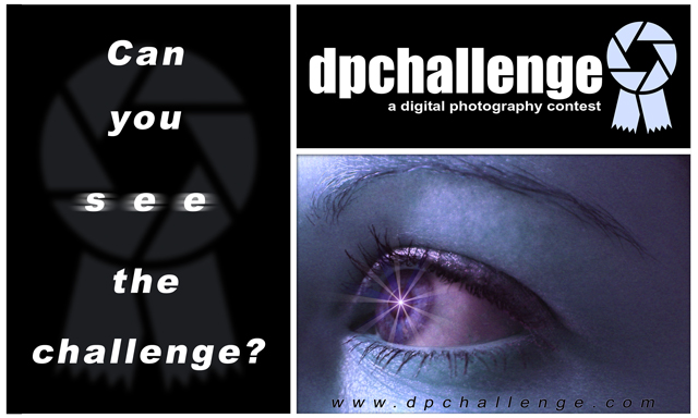
Excellent idea. I love the knocked-out text and the slogan. The URL is present but not overpowering. The logo is zoned well. And, of course, the photo is awesome. :)
Top Rated, very nice. if any change, I would have liked to see more blue in the eye and a slight change to something else in the skin tone, possibly B&W skni tone.
Excellent Work, should be a Winner
Nice treatment of image.
Not keen on overall composition - the divisions just don't seem to be the right size to balance each other - especially when two are black and one so light.
The website name is hard to read.
Not keen on faded logo beneath left panel or the blurred "see" text.
Best imrovement to me would be to completely lose the left panel - I like the resulting square sticker rather a lot.
5, Kavey






 Can you see the challenge?
 Add photograph to your favorites
 Add photographer to your favorites

 Photographer found comment helpful.


