Author Thread Comments Made During the Challenge
Post actions
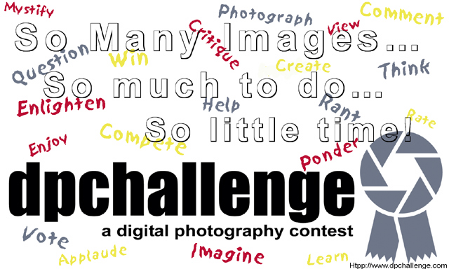
I think maybe the "so many images..." should be a different color- it's kinda hard to see. Maybe that's what you were aiming for?
Post actions
I really love this...very creative!
Post actions
Good idea. I'd move the last line more to the left so it doesn't overlap the ribbon and has the same indent as the line above. I'd move up mothe the ribbon and the URL to make sure they fit in the printing process.
Post actions
this could be an idea, however, it needs more contrast, i think
Post actions
I wonder if solid letters in the first 3 rows would help disfuse the busy look?
Post actions
I think it's a little too busy.
Post actions
Good idea. Where is the photo lingo.
Post actions
creative idea, but the final outcome, well, it confuses me.
Post actions
i think this is a cute idea if you faded the background with all the scribbles to about 15% opacity and made the top text stand out more.
Post actions
Too busy, too cluttered, I find this overwhelming.
Post actions
Message sounds whiny but it is creative.





 Add photograph to your favorites
 Add photographer to your favorites


 Photographer found comment helpful.


