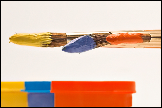
The colors and the light here are wonderful. The one thing that keeps this from a top pick is the soft focus on the paint cans. They (in my "I'm not good enough a photographer yet to have" opinion) need to be sharp like the brushes.
I like this picture and the idea. Personally, I'm not fond of the flatness of the composition. Doing something compositionally to give it more perspective would have helped this picture (IMHO)
Nicely arranged. I like the break in continuity exhibited by the bent brush in the middle. It adds interest. Very creative. A little more saturation might make the colors jump out a little more.
Good concept. Nice colors & subject matter. I think the composition would have been more interesting had the brushes were placed in a diagonal. Also the contrast could have been punched up a bit to emphasize the bold colors. Good work.
Red looks orange on my screen, and I just checked the monitor before writing this comment. But that's besides the point, as this is not the primary colours challenge. Like the brushes and esp. how the middle one is bent.
The paint on the brushes is very interesting and attractive. The parallelism of shape between the brushes and bars is interesting. And the lighting is beautiful.
There are a few quibbles one might have. The paint colors do not seem to match tha colors of the bars - for whatever reason. In fact, the bars don't seem to match - there apears to be a slightly greenish azure blue and a less saturated but more primal blue. Somehow, the way the brushes are so tightly aligned seems gratuitously static, especially because the materials in the brushes are the only sources of life in the photo - and the globs of paint obscure them. It is so artistically done that I am sure the photographer has a thousand times or perhaps a million times the training in the graphical arts as the commentator; still I feel strongly about these niggling little details...





 Add photograph to your favorites
 Add photographer to your favorites


 Photographer found comment helpful.


