We all know what the challenge title is. It is too bad that you could not take the time to be more creative with your titleing.
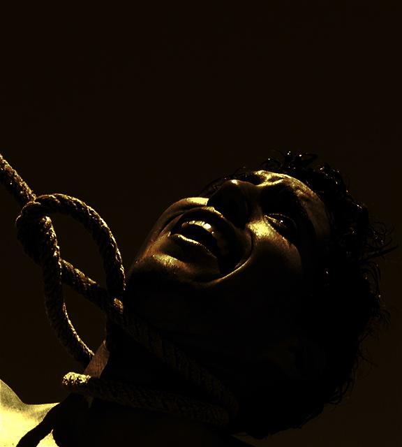
nice comp, too dark, can't tell what to look at, top lighting ok, bkacks ok, whites need work, color flat, nice shadowing, nice texture, overall could of been better
Just wanted to say, that while I personally do not like this image, it is overall a very good picture. The lighting, depth of field, and your point ov view are all really great.
Good photo, but in terms of the challenge, would do better if you just showed the empty nose hanging in the air. that would put much more emphasis on it.
While this is not a subject that I typically like to see, your treatment of it is quite good. The lighting perfectly fits the subject and mood. The composition is excellent.
Interesting image. I like the lighting. I think it creates some interesting shadows and highlights all the right things as well. I'm not really sure that the 'main subject is clearly a circle', but it is definately implied, and that's good for something. One thing I don't like is how the rope is leaving the photo out the left side. This seems awkward to me. Seems like it should be leaving the photo out the top. That may also help bring a bit of balance to the shot. Right now, it's left side heavy. Looks like you have a dead pixel direcly above the nose. Not like that affects your score any, just an observation in case you didn't know. You can clone it out in advanced challenges, but not in basic, so probably doesn't matter much anyway. ~Heather~
out of the box?...absolutely...it's just that I'm a bit tired of these kind of images...they are actually becoming a bit boring / tedious hence loosing their effectiveness I think...I'm way to jaded...sorry.





 Add photograph to your favorites
 Add photographer to your favorites


 Photographer found comment helpful.


