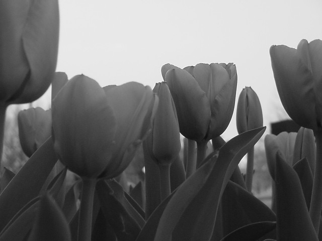
A color picture sans the color. This is very bleak looking. Learn some post processing techniques to improve the dynamic. If you look at a histogram of this image, and I did, the brightness range is comressed. The lighting is also not right for the kind of shot. Directional light was make this more interesting, here you are shooting into the shadow.
On my monitor this looks a little gray. If that was the look you were going for, great...but I'd like to see more contrast of the blacks and whites. But that's just my opinion.
I know titles aren't supposed to count, but something like "Foggy Fields" might help give the grayness more context for a photo like this...This image would probably render beautifully if you ran it through a Photoshop or Painter flter like charcoal, etching, watercolor, etc. (I like "re-purposing" images I like as many ways as I can think of).
Your subjects range in tone from black to about middle gray - not enough tonal range, especially when they have to compete for attention with the bright (though flat and not pure white) sky. Increasing the brightness and gamma (middle gray value) might help, but this is hard to pull off. Big oof flower at L could be cropped away.
IMO, there's not enough contrast in here (sky vs. flowers, yes, but the flowers are just similar shades of gray). I do like the composition (cropped flowers at the sides to frame). I think the whole tulip on the left should be the one in focus.







 Add photograph to your favorites
 Add photographer to your favorites


