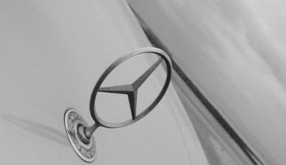
I like the dramatic angle you have chosen to present this with. It really adds interest to the shot, and makes it different. I also like that it is place in the lower left and in a sense, leads the viewer's eyes up and into the frame. I think the positioning of it gives a stable feeling to the picture, and a solid place to "rest the eyes."
To make it stronger, I think it may have been beneficial to either present it in color, or use more contrast in the bw. Right now, it is a muddled look to me, no distinct black or white, or even dark/light gray -- all of the grays are sort of in the middle of the spectrum. I think a crisply focused shot in color would have also had a nice effect.
Finally, the shot looks a little grainy to me. I understand this may be intentional sometimes, but I'm not sure it is truly effective here. Maybe a lower ISO would have eliminated some of that.
If you have questions or comments, please let me know. Best to you in future challenges!
by shooting this image at an angle i think you may have taken away from the end result, i may have taken it straight on to get a better effect, however, i like the idea 4
I like the use of black and white, but this image is too plain. Not to mention it is photographed at a strange angle. Maybe if you photographed more of the car, the picture would create more of a mood.
nice emblem, however I'd like to see more contrast and tones. Try playing around with the Levels functions in Photoshop or Histograms Adjustments in Paint Shop Pro. Jacko.
Nice grain and perspective. The abstractness of this adds to the "allure" of what you've achieved here. It would have been nice to have the "star" a bit shinier, but that is a small criticism. Overall, high marks for this one.





 Add photograph to your favorites
 Add photographer to your favorites


 Photographer found comment helpful.


