Author Thread Comments Made During the Challenge
Post actions
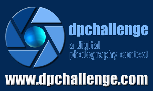
same thing about the white text at the bottom, other than that it is a great design
Post actions
good for a sticker. Why do you need to repeat the dpchallenge.
Post actions
It's very simple, but that's exactly what I like about it. Uncluttered and easy to read from a distance. Nice!
Post actions
Post actions
Simple and to the point. Easy to look at with the run of blue colors. The 3D effect of the lettering and symbol makes it very outstanding.
Post actions
Very Nice, almost too blue. Got a shot at being the Winner
Post actions
This is clean, sharp, easy to read script. Very good in my opinion.
Post actions
Nicely clear and Concise. With comfortable colours and balance
Post actions
Nice bold lettering.. like the other one, a ribbon faded in behind the URL would have been nice.
Post actions
Clean and simple, I like it - 9
Post actions
I think that this and your dpcprints one are the best of both challenges. It's a nice color scheme, clear and easy to read and an eye-catching graphic. Good job!
Post actions
Clean, simple, strong colour choices and good layout and choice of font.
Post actions
Your 'world' is lit by three suns! I like the fonts.
Post actions
excellent work... simplicity and straight to the point... great advertising tactics in this one without too much flare. my favorite design.... great work... btw- the one like this in the other challenge is also my favorite pick....
Post actions
Nice, clean, catchy design. One of my favs. 10




 Add photograph to your favorites
 Add photographer to your favorites


