Author Thread Comments Made During the Challenge
Post actions
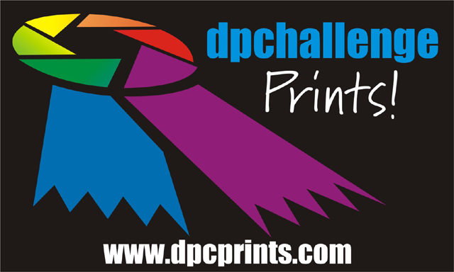
Really good! Nice and colorful on a very good bg. Right to the point, containing all the pertinent info. Got the logo in there. Very, very good. One of my top 3. Good luck! Actually giving it a 10!
Post actions
same comments as the dpchallenge.com sticker entry...
Post actions
This was one of the few that didn't have photos included in the design that I actually like. The ribbon looks nice with the color wheel done on it.
Post actions
I like how you've adapted the logo, but don't think the purpose or "product" would be clear to a "stranger" who just happens to see the sticker.
Post actions
Post actions
one of my top three....nice work
Post actions
Nice that it's simple and the colours are attractive.
Post actions
Very simple - but will people outside of the site be motivated to come here? Will they know what it's about? I like the elongated ribbon!
Post actions
I think there are too many colours in this, which looks kinda confusing, but the design is bold and simple, which looks good overall.
Post actions
Excellent design work, but does it tell someone who's never seen it what DPC Pritns is?
Post actions
So far I think this is the best. 9. I looked at all of these (for the first time) from a thumbnail view first and this one really stands out. Good job!





 Add photograph to your favorites
 Add photographer to your favorites


