Author Thread Comments Made During the Challenge
Post actions
Post actions
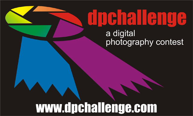
Nice and bright catches yr attention
Post actions
plain and simple.... that is -imo- what graphic design is all about, I like it! I don't know about the meaning of the colors, but I was planning to enter this challenge and was going to use different colors to represent different cultures, countries, tastes, techniques, etc... though I may have not repeated a color... I didn't have time to work on my idea.. good luck!
Post actions
Nice clean submission, good work. I like the black background and mix of colors.
Post actions
Very well composed..dramatic use of colors and of the logo.(10)
Post actions
I find the ribbon a bit too dominant
Post actions
Nice blend of the yellow into the green, and nice big URL.
Post actions
Post actions
I like the simplicity of this design... not too much crammed into one space.
Post actions
Nice that it's simple and the colours are attractive.
Post actions
Great colors. A clean looking ad! Great job!
Post actions
Good idea and treatment but redundency in wording.
Post actions
This one is the best 10 here!
Post actions
I like the design here, very nice... and the color wheel on the ribbon is a neat idea. Well done. One of my 3 favs.







 Add photograph to your favorites
 Add photographer to your favorites


