Looking at your photograph Two things immediately jump to mind.
First, I love your choice of Black and white. The black background showcases it all the more.
Your focus is good and clear, with no soft spots.
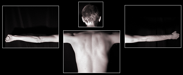
The other thing, is to me this apears to be a childs head on an adult body. Maybe its just the angle you shot, or the shadows, or maybe this is exactly what it is and you meant for it to be this way. If this is the case then maybe a different title would have helped others to understand the look you were going for.
All in all an excellent attempt. Keep up the great work.
The proportions of this photo don't seem to match really well. It may be the way the shadows are, but it just seems odd. The head seems more than a little bit small. Conceptually its a pretty good idea.
This is a very fun image.
The only complaint I have is the detail in the background on the left arm image. The rest of the compilation is all black in the background. Still, it's a 9 to me. Nice work.
There's another submission in the same vein and i like them both. What's very effective here is all the black and the thin white borders. Putting all those body parts in boxes, underscore the sense of feeling disconnected. Well thought out and well done. 8 Journey






 Add photograph to your favorites
 Add photographer to your favorites

 Photographer found comment helpful.


