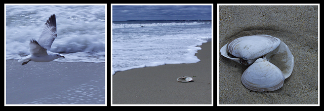
Thanks for the comments. No. the blue cast was not intentinal. I messed up on the WB.. but sometimes mistakes have neat results. I have to say this is not a favorite of mine, yet agree that I like the tranquility of it. I will frame it for my "summer theme" front porch to help greet guests to my home.
:0)
Karen, had given you an 8 but no time to comment. I pretty much guessed you did this. I really like the mood of this presentation - i can see/sense you spend a lot of time on the beach. Lovely colors, very tranquil. This image also reminded me of another one of yours, that i liked a lot, the one in Negative Space, Coming and Going?
Wow. I'm a sucker for a good beach scene, and I get three here! Particularly, I like the middle and right photos, though if you look at my "fauna" entry, you'll see that I can appreciate how hard it is to capture a gull! Fantastic!
The frames work well together, though the center and right are similar enough when the bird is so dissimilar. Still very nice tones and gentle colors. Nice work!
I like the progression from water, to water and sand, to sand. However, none of these shots strike me as particularly powerful to me. Each one seems rather muted or dull for some reason. The first shot looks like it needed a little shorter exposure as well. 5
Nice series. I would suggest two things: showing some sky in the first image with the gull to offer the complete set of elements involved in this story and to reduce the white borders to a 1 pixel width. 7






 Add photograph to your favorites
 Add photographer to your favorites


 Photographer found comment helpful.


