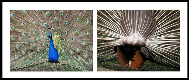
Great colors. Hard to see the focus with it being small because of the constraints, but looks ok. Some symmetry working throughout. I would like to have seen the pictures (front and back) taken at about the same or opposing angles, that may have balanced out the composition a bit more
a unique display. I think most people would have shown the peacock's crest in a close up, but I like how you have turned him around! :0)
sorta "now you see me, now you don't".. nice framing, composition, lines and patterns in the feathers. good for you.
I love peacock photos and this one is funny too! It would have been good if you flipped the shots so they were leading into the center instead of out the sides, so that my eyes aren't led out of the frame so easily.
LOL...love the humor and your take on the challenge. There is quite a difference between the front and back of a peacock...that I didn't realize. Anyway, I think I would have liked to see the front of the bird as close up as the back of it. I think you still could have gotten in plenty of the lovely feathers. Plus, the colors don't seem to stand out as well. I really like your idea, though. Nice set.






 Add photograph to your favorites
 Add photographer to your favorites


 Photographer found comment helpful.


