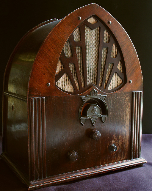
A single darker light source (upper right) might have better for this - something with a strong yellow hue. For me there is too much reflection on the radio itself (side and front panels), drawing the eye 'away' from the object.
excellent composition I really like the diagonal lines. I think the lighting could have been a bit more balanced with a possible use of highlighting on the front.






 Add photograph to your favorites
 Add photographer to your favorites


 Photographer found comment helpful.


