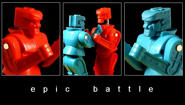
I guess the uneven distance from the edges of the white ellipses ( in the side images ) is a little disturbing in a symmetric composition like this. Also i fell if the central image had the two of them in a close up (closer that the side images -may be just the intreference of the hands), it can work better.
I like this one. The two outside shots work great for demonstrating the two sides of the battle. The reversal of sides in the center frame forms great color contrast. The amusing nature of the shot is demonstrated effectively. The shots flow together well. Beautiful. 9
This is way cool...
I'm 38, so I had a Rock em Sock em robot set when I was a kid!
This brings back memories, not to mention your photos are great!
Nice work, and I give it a 10
JD Anderson
Your models make me laugh! It's been ages since I've seen these guys! Your choice of black background was really good. Those colors are incredible. Great idea!
I never would have thunk it, but this simple subject matter turned into a very nice, artful set of pictures. When first looking at it, the end pictures of the single "fighter" are identically framed in their picture. After looking closer, I can tell differences, but at least the angle is the same. There is some glare, but it's not overly distracting. One thing I'm finding interesting is that the red guy seems a little blurry, but the blue one is perfect. Does this have something to do with the way lighting affects red in digital photography? I think I heard something about that subject. Anyway, I like this triptych. Good luck in the challenge. 9
Great! What is really cool is the two "close ups" on the outside and then the reversed colors of them fighting in the middle pic. I like the text also.
Excellent composition on this series.. The strong color really makes this image stand out nicely :) I have one of these but it's just an old and tattered relic of my childhood now... great shot :) - setzler
Nice! My kids love it! I like the colours, and the layout. I like the words all in lower case. One nitpicky comment: it looks to me as if the picture to the left is just a tad bigger than the other two?






 Add photograph to your favorites
 Add photographer to your favorites


 Photographer found comment helpful.


