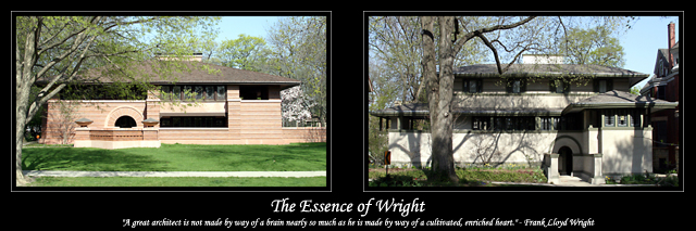
FIRST IMPRESSION: Great choice of subject, nice similar composition.
CHALLENGE: Meets the challenge.
COMPOSITION: The photograph on the left is composed very well. The one on the right is also very strong, though the tree in the front is a bit distracting. Not much you could do to remove it, though.
TECHNICAL: Exposure in both this is good and probably about as similar as you could get it between the two shots.
CONCLUSION: A great subject, and you do Mr. Wright justice with these representations of his work. I wonder if placing the shots one above the other might be stronger (then again, it might not). Great choice of quote, as well, it's a shame the size limitations make it almost unreadable.
Thanks for sharing and good luck in future challenges!
Frank would have been pleased with this. I think perhaps the image on the right is disturbed with the shadows from the tree, however, considering FLW's designs that blended structure and the natural landscape into one, in a way, it goes along with his design... Nice work. 9
Fun stuff! I happen to be a huge fan of Wright, so I find this very engaging. I really can't read the small text, though in poster form it would probably work, and I wish the point of view of these structures were such that the interesting and unique things about Wright's architecture (the "essence" of Wright) were really displayed. They just look like houses here.
The writing on the bottom is quite too small to read well, so I think I'm missing the "story" in this. The house is interesting, but the left photo is covered by the tree and shadow of the tree and most of it is hard to see much of. It looks like these photos were taken at different times of the year. The photo on the right is much more green that on the left. There are also many more tree buds on the right. I am curious to know exactly what was on your mind when creating this series. Good luck in the challenge.





 Add photograph to your favorites
 Add photographer to your favorites


 Photographer found comment helpful.


