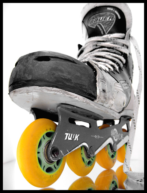
I live on a large college campus and frequently skate to class. Scratches & overall damage c/o hockey applications.
Setup includes: $3 mirror from Wal Mart, 2 pieces of posterboard, lots of tape and one broken hockey stick.
This one took a bit of preparation. The lighting is all natural sunlight, filtered in behind the backdrop. I used manual exposure, manual focus. I intentionally overexposed the background to make the skate have more impact.
I don't like the edges shown on the left and right, but was unable to get rid of them. The image is cropped tightly on the top b/c that's where the hockey stick is to keep the skate upright (kinda like a foot). Lots of scotch tape was used to hold the whole thing together.
Composition: I basically like the composition. There are only some minor things I would like to suggest. First I do not understand your use of the mirror. The reflection is barely included and to me the "additional" yellow wheels in the reflection distract from the "real" yellow wheels. I think it would look better when you would have used a plain white surface, like the background.
The other thing which bothers me is the shoelace on the right side of the photo. The wheels obviously are the point of interest here, but the shoelace conceals the rear part of them and blocks the view.
Then some would say that the almost perfect white background is disturbed by the little grey shadow from the edge of the mirror (left side of the photo). But in this case I think it even fits because it prolongs the line of the wheels and thus strengthens the composition.
The tight crop on the top is no problem in my opinion.
Lighting/Colours: The lighting is great. Sunlight always is the best :) I also like the colours. Desaturation of all colours except one is almost a classic but I like it everytime and in your case it adds to the message of your photo. Maybe red wheels instead of yellow ones (by a little hue adjustment) would have increased the "hot" impact even more.
Focus: The shallow DOF is good because it gives the photo depth. But I understand that somebody commented that he would like to see the top in focus. The point which is in focus (the "nose" of the shoe) is not very interesting itself, so your eyes start wandering around. There is some writing and the knotted laces which on the top which draw attention of the viewer, but when you look there, it is blurred. I don't know how the photo would look like when you switch the focus points, making the rear in focus and blur the front. Probably not a good idea, so the other solution would be to blur the top even more. But that's only a minor issue.
Another idea would be to add motion blur by moving the skate during exposure. That would make the photo much more dynamic and I think it would fit great to your "hot wheels" theme.
Challenge: Yes, challenge met, although without knowing the theme, the photo would rather convey a "sports" message.
Creativity: It's a nice idea to use a skate as your subject for this challenge. A clever setup to get the skate stand up.
Ok, that are my suggestions. If you want to further discuss about this photo, feel free to email me.
P.S.: I think it's extraordinary how you give additional information to your photo, e.g. teh detailed photographer's comment and the setup shot. That makes it much more interesting to look through your photos and I can learn from your information. Just wanted to say that. Thanks :)
Thanks to everyone for their comments and votes. With the top of the skate in focus, it really wasn't as interesting, hence the shallow dof used. I would've liked it even shallower, but without macro lenses I think that's the best my camera can do in that respect. I think I should have tried harder to hide the hockey stick so the skate wouldn't be cropped so tightly on top, but I'm surprised noone mentioned that.
I've posted a pic of the setup here ---I've taken the picture down to free up space---
a lot of people frown upon desaturation, think of it as gimmicky, but it really works to draw attention to the important element of a picture, and I think you used it effectively here. I like the reflections and the linearness of the wheels. I like the DOF where you've thrown the brand of the skate slightly out of focus. well done!
nice image. useful for quite a few applications. nice perspective, leading lines, and dof... like the inclusion of the reflection as it adds more interest too.





 Add photograph to your favorites
 Add photographer to your favorites

 Photographer found comment helpful.


