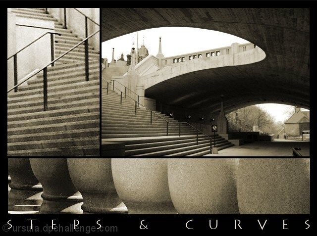
The two top pictures are of an underpass in downtown Ottawa. The third (bottom) picture is a detail of a cement railing by the Chateau Laurier, also in downtown Ottawa.
The graininess is on purpose. All three pictures are colourised (tone 29, step +/-40).
Statistics
Place: 9 out of 116 Avg (all users): 6.7465 Avg (commenters): 8.0000 Avg (participants): 6.6444 Avg (non-participants): 6.9231 Views since voting: 3244 Votes: 142 Comments: 28 Favorites: 5 (view)
outstanding image. If I had one nit to pick it would be that the first set of stairs was a bit grainy in relation to the rest of the image. Still a 10, though. Great work!
I really love this one. Good architectural studies are fascinating, and hard to do, at least for me. This one is great. The only small complaint is the stairs. They seem a bit soft, or out of focus.
This is a nice piece to look at because of the contrast in images, tone and angles. The steps on the left upper pic look a tiny bit soft, or it could just be me. Good job. 9
The top left image looks over cropped (blurry, low resolution). The top left, and bottom images are somewhat interesting, although not particularly drawing. However, the top right image is excelent. The curves and lines work quite effectively in it, and I think it would be better as a stand alone image than this is as a multi-image.
A clean, unostentatious re-presentation of shapes, presenting a fresh consideration through simple juxtaposition, gentle use of sepia tone that lends itself to the urban.
Very nice way to document a place, well cropped set of shapes. There is something that bothers me with the framing, perhaps the inner strips are too thin or the outer ones are to thick (?) The caption seems a little redundant, what we are seeing, you've made it pretty clear; the name of the city or bridge would have been an added value. 9
I love good architectural photos and these are no exception. The toning you chose seems to add a nice mood to the lines and curves as well. The only possible improvement I can see would possibly to add a little more spacing between the photos to create a stronger definition between each... nice work :) - setzler
I love the large shot on the top right! The close up of the steps look fuzzy and takes away from the rest of the shot. well composed and nice lettering/font.
I love this. All three are great compositions and your choice of putting them together is perfect. Sepia is good and the text too. My top favourite this week. Well done and good luck!
I had an idea to go with an archtectural poster type of thing, but ended up doing something else...I checkened-out of putting a title on mine too, but I'm glad you added your's. Only tiny thing I could suggest would be to make the upper-right photo a little larger, crop some of the result on the top and right, and have that upper "swoop" come close to the angle of the bannister, and lose all or most of the house through the tunnel, which I think is a little distraction.
This is wonderful , the composition is beautiful and has a strong impact, I love the curves. The only nit-pick is that the top left image seems a little too grainy. Good Luck!9







 Add photograph to your favorites
 Add photographer to your favorites

 Photographer found comment helpful.


