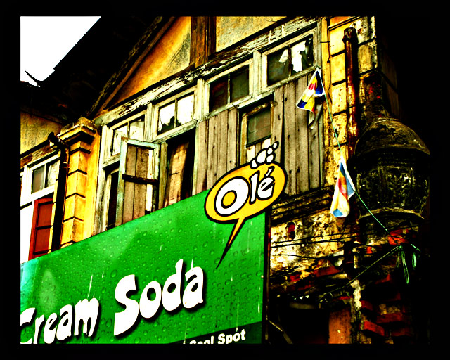
This will be 4.5 or less. People will ask if this is meeting the obsolete theme, and hand out 4s or lower for that. This will be lost amidst all the pretty stock shots. I like this image, and the sentiment behind it.
Statistics
Place: 236 out of 453 Avg (all users): 4.9173 Avg (commenters): 5.2000 Avg (participants): 4.6447 Avg (non-participants): 5.2460 Views since voting: 655 Views during voting: 360 Votes: 278 Comments: 12 Favorites: 1 (view)
Just caught this in your portfolio and saw the related challenge theme. Can't believe how tremendously under-rated it was. I think this shot says so much: the obsolete old building and the values that go with it, to be replaced or overshadowed by a cheap-looking billboard and all the "non-values" that go with that ... Maybe I read too much into an image but I love images that seem to communicate something and if I even succeed just by half to do the same with mine, I'd be happy, which is not the case at the moment :(
The Cream Soda ad takes up a lot of the photo (because of its size & the strong solid color giving it lots of visual impact) - it almost becomes the subject of the photo (with the old building becoming an interesting background feature).
Like the post-processing, though. Extra points because of that!
I think I'm supposed to be looking at boarded up windows. but there's a giant lime green thing screaming for my attention. My first thought was the soda was obsolete - I like the post effect a lot, the composition is why I'm scoring this lower 4
I see the focal point of this image tobe the billboard. Billboards are not obsolete and the sign does not look forgotten or run down. I like it overall,but it does not fit this challenge IMHO.





 Add photograph to your favorites
 Add photographer to your favorites

 Photographer found comment helpful.


