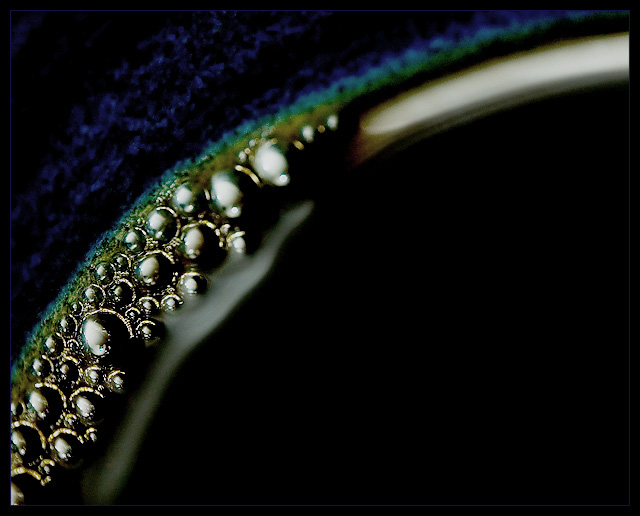
a little oversharpened to compensate for clarity. More abstract than anything, with is underappreciated. But I actually don't think it works 100% here.
Technical: 6, Sharp where it counts while showing shallow DOF
Appeal: 3, For me, it's just too "dark" overall (which may be very appealing to some, but for me, a happy person who likes bright colors, it doesn't work well).
Challenge: 5, Hard to put the size into context ... what are we really looking at? Is it something small and really close up? Or something larger? In other words, I think it needs something to help give the image context.
Overall Calculated Average Score: 5, Not really a bad pic, and technically okay, just not one that appeals to me.







 Add photograph to your favorites
 Add photographer to your favorites


 Photographer found comment helpful.


