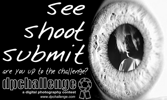
Wow. A ribbon. I almost pulled this shot before voting started because my triptych which used the same eye image was getting low scores. Needless to say I was not expecting to do this well. It feels kind of illigitimate to have my highest score for a graphic design contest instead of photography, but I'm certainly not disappointed.
Thanks to everyone for the valuable feedback.
I should also thank my friend becky, as she is the one in this shot ( //www.dpchallenge.com/image.php?IMAGE_ID=17161 ) which I used in the eye.
I really liked this submission. Congratulations on getting a ribon. I think playing around with other pictures to use for the pupil would be rewarding and could improve this even more. The text all matches and flows well. Great work!
Nice work! Just my opinion here, but I almost wish the dpchallenge logo were color, providing a nice contrast with the rest of the design. Just my opinion, though!
I like this a lot - it's nicely put together and I like the composition.
The single thing I find really offputting is the image chosen to appear in the pupil! Sorry! I don't mean the model is unattractive but that this shot of them is not right for this composite, IMHO.
8, Kavey
As a graphic artist myself, I understand simple, yet powerful messages! You have done that well here! The balance, strength and b/w format of this sticker creates a need to be read! Great work! A solid 10!






 See. Shoot. Submit.
 Add photograph to your favorites
 Add photographer to your favorites


 Photographer found comment helpful.


