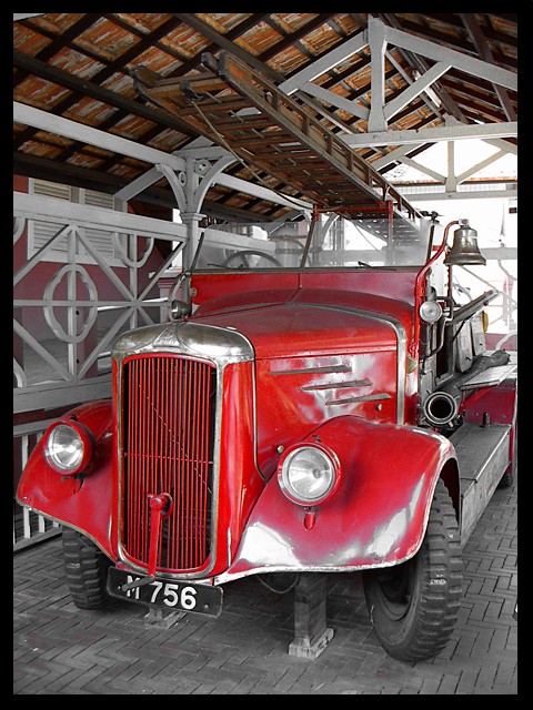
This is a good (and interesting) shot overall. What might improve it? It looks as though a bit more contrast would add punch. Also, the left edge crop is very tight.
On a reshoot, you might consider the following: the ceiling matches the ladders, and thus, it doesn't stand apart from its background. In fact, if you look around the setting, there's more of that--the reddish wall on the left, the bright background versus the highlights. Recompose, or even using fill flash to allow the background to be darker in general might make it really stand out.
Thanks for the comment you were kind enough to leave on my obsolete entry.
Yours was an excellent find and deserves to be your personal best. CONGRATULATIONS.
Very cool photo!!! The vibrant red looks great against what looks almost like a black and white background. It looks like a poster, or a framed wall print. I love it. 10







 Add photograph to your favorites
 Add photographer to your favorites


 Photographer found comment helpful.


