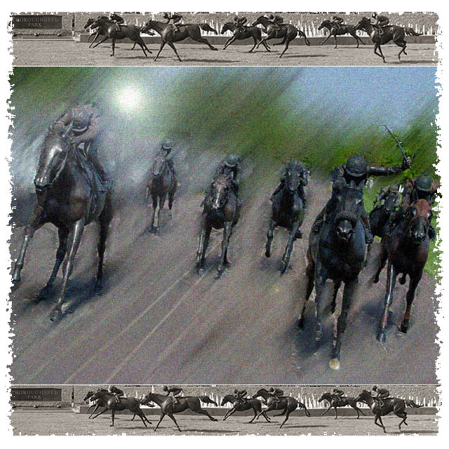
Lots of post shot adjustments with PSE2. I want this to look like a canvas oil painting. Used photomerge, motiom blur, lens flare, spatter frame, added noise, removed color of panoramic and added sepia. Wish the size of the submission could have been bigger. By the way the original photographs were of statues in a park in downtown Lexington.
Statistics
Place: 30 out of 116 Avg (all users): 6.2183 Avg (commenters): 7.2632 Avg (participants): 6.0220 Avg (non-participants): 6.5686 Views since voting: 1475 Votes: 142 Comments: 24 Favorites: 0
It will be difficult for me to comment on this entry as a photo, as it is more "digital art" than photography.
First impressions: It meets the challenge, it is good to look at, I like the vertical arrangement, the border really complements the watercolour/oil pastels look. It's a good entry for this challenge, and your score reflected that.
Composition: Like I said above, I like the vertical arrangement in this case. The very thin white spaces between the pictures are just right. The contrast between the diagonal, colourful middle picture and the horizontal, sepia coloured top and bottom pictures gives a good sense of movement, much more than if the middle picture were by itself. The border is quite appropriate to the composition.
Effects: The effects are pronounced, but in this case they look right, they are not at all overdone. Your score might have suffered because of the post-processing, but, knowing now that the pictures are of statues, not real horses, I think presenting them this way was the better choice.
When you look at this entry from a distance, the top and bottom pictures look more like a "frame" than pictures. It's interesting to look at this entry close-up and from a distance.
I don't know what else to tell you - as it is, this is quite good. You might want to sell it as a poster. I looked at your portfolio, and you have four other multi-image compositions: I think this one is the best of the four. By the way, it is good to know that you weren't standing in the path of the horses when you took the picture!
This is just the coolest triptych! I can imagine that a lot of peeps will say that you "over-photoshopped" it, but I love it! The effects are great, and the overall look is nicely cohesive. I love the border effect as well. I admit that the large center photo kind of throws me because I can't figure out all the effects, but hey, it's still one of my top picks.
Well, it's an interesting image. The top and bottom shots frame the middle shot pretty well. The effect here is effectively applied, and applicable to the shot, as it is intended to display motion. So I'd say this is more than just photoshop for the sake of photoshop, however, I wouldn't really say this is a photograph so much as a piece of art that used a photograph as it's basis, so I'm not as inclined to score it as highly in a photography contest. Good luck. 5
Pretty neat... should have made the bottom pic of the horses running to the right, instead, to "balance" it. Nice effect on the middle shot. I don't really like the border however. Good overall job.
I am not fan of those borders ... but I like it here. And the tryptique is impressive, the middle shot impressive, the color/desaturated mix perfect. very nice. 9
This is a cool, nearly painted look. Challenge met. IMHO, I think the central image is too far manipulated, it looks very cool, but like a painting, not like a photo. 5 Rob the Swash





 Add photograph to your favorites
 Add photographer to your favorites

 Photographer found comment helpful.


