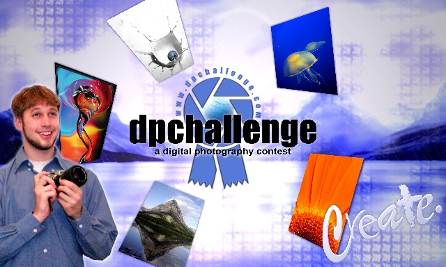
Basically, you're all right about the photographer - though it looked good in my mind, it didn't turn out so well in the design, and I should've recognized that. It is significantly improved as an abstract design without the inclusion of the photographer (and I assure you, I'm not generally that "droll" and this is certainly the first time I've earned the dubious distinction of "goose").
The guy with camera seems a little out of place, and the look on his face is a little overdone. Perhaps if the circle of pictures were shifted a little to the right it would make the design a little more balanced as well. Also, each of those individual pictures would be very small on a 3x5 sticker. Dispite all that, this is a very well done design that effectively conveys the appeal of the site, and would do a good job of attracting interest I think. 8





 Add photograph to your favorites
 Add photographer to your favorites


