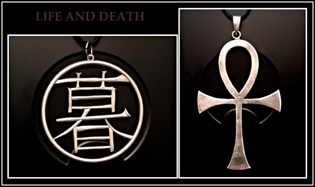
The object behind the two pieces of jewelry is a computer case with an interesting design. I liked how the design on the case works with the jewlry to enhance the image, and shapes. this is my second attempt at doing this, and i felt like pulling my hair out by the end. I think I'll get a 3 or a 4 again.
Statistics
Place: 50 out of 116 Avg (all users): 5.7895 Avg (commenters): 6.5714 Avg (participants): 5.7386 Avg (non-participants): 5.8889 Views since voting: 1350 Votes: 133 Comments: 10 Favorites: 2 (view)
Composition - I really like the 2 charms on the necklaces. It's not a photo I would have even thought to do, but it really works. The little symbol on your computer case worked well as a common background for both. They both look like they are supposed to be there. That was a great idea. Good strong composition for both images, but especially together.
Technical - I like the greyscale idea. That makes them look classically old. The only thing is I wish they were sharpened one more time before you submitted. I do fear it a little though. You may have tried it and it didn't work well for you. The reason I fear it on the first one is because there is a little too much light on your background and that can really play hell with the sharpen feature in PS as it will bring all the little tiny white dots of light on the case and bring them to the forefront, making them look like a heavy coat of white dust on the background. Other than that, I think the exposure and framing and all that look good.
Overall - This is a nice image as is. But what I would've tried to do is put a little gleam of light or something on the "life" symbol to make it a little more symbolic and to catch the viewer's eye a little more. As it is, it's a bit flat. The ankh I might darken down a little for the symbolic thing, but it looks pretty good as is. I like this picture and I'm glad it made it in your top 4. Nice job and good luck - Bob
Good idea to use this background with the jewelery. Also like the idea of Death vs Life, the mix of cultures, the dark vs silver and the whole composition.
One improvement could be to take off the carrying rope off and perhaps even to grind the hanging eyes off the top.
It was one of my favs.
Really engaging and fascinating juxaposition here, and your bold and simple approach really works well. Not quite sharp on my monitor, but what great work!
Hi Da!
Can't read the text - it's just too dark on my monitor - well, I can if I get REALLY close to the screen but that's not too practical. I like the two images but the layout doesn't work for me - it doesn't feel balanced or deliberately composed.
I really like this image quite a bit. I'm one who enjoys shapes and patterns and this image works well for me because of that. There are only two minor issues that I think could use some improvement in this composition.... 1 - the text at the top could stand to be just a tad brigher and 2 - the spacing between the two images should probably match the spacing on the outer edges of the frame so it doesn't look like they are just stuffed together. Presentation is everything in a composition like this :) Excellent shot, great idea and the black and white makes this one very strong.... great work :) - setzler






 Add photograph to your favorites
 Add photographer to your favorites

 Photographer found comment helpful.


