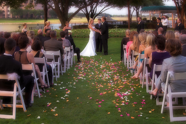
I didn't vote on all the shots in the challenge, but this would not have caught my eyes. I think it meets the challenge theme well enough, but it doesn't tickle my oomph bone. There are a lot of busy-ness, and although the leading line does lead to the couple, its angling isn't dramatic enough. Maybe it's something that could have been improved from a different shooting perspective or height, ie kneeling or even down on the ground. The way it is, it just feels too eye level.
I don't think there is quite a soft focus treatment, but there's definitely a lack of an edge, and a general bland casting. Some of the skin tones feel unnatural given the lighting, to my eyes.
In terms of whether or not this is out of the box, I personally feel this is firmly within a fairly conventional box. (I do realize this is a very subjective, and potentially touchy point, but I wanted to be fair to this image and be frank about it. I don't mean to offend.) All in all, I probably would have given this a 5 or 6, depending on my mood during the moment that this image came up on my screen for a vote. I don't think it deserves below a 5, but that's just my opinion.
*There seems to be some blowout in the whites of her dress.
*The image as a whole feels cluttered to me, in particular the background field, buildings and trees make it fussy. I accept you have no control over that as a photographer since you didn't choose the location but the question of "why it couldn't have been a stronger shot" is never the viewer's concern.
*It's the kind of wedding shot that will no doubt appeal to the wedding party as a record of the setting and of their special day but it's not the kind of "generic" wedding shot that might appeal to non-associated viewers or even to those looking for stock images of weddings. It lacks mass appeal, in my opinion.
*Whilst the leading lines are clear to me I don't think this image is a particular strong example of the technique.
*Because of the distance, I can't really see any detail in the bride and groom and yet this is what the lines, such as they exist, are pulling my focus towards. All the detail seems to be in the foreground wedding guests. That inability to see detail in the bridal party leaves me disinterested in the focal point of the leading lines which makes me feel they are not used successfully here.
Hi Laurie, I like this shot and I think it has well defined lead lines that actually lead the viewer to a subject. Without the subject it becomes a perspective study. I like the soft focus and I particularly like all the shoes in the isle. It is a well positioned "centered" composition that doesn't feel centered. It has a variety of leadlines, bold and subtle. The line of sight of the spectators and the flower petals are coincidently ingenious. I gave this an 8
Hey Laurie, I knew this had to be you! I don't know what it's doing down in the 80th place, but I thought it was great. I wondered if, being a wedding shot, might have skewed my perspective a little... still, I loved how the lines from the chairs, the petals, even the "lighting" appeared to guide me right straight in to the couple and then "bam" there they were. Awesome shot!
I especially like how the legs of the women seated on the aisles also lead one's eye back to the central focal point. Too bad the bride has that tree growing out of her head, though ;) All in all, a good entry that should do well.







 Add photograph to your favorites
 Add photographer to your favorites

 Photographer found comment helpful.


