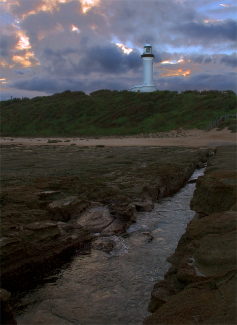
everything is so dark that it makes it seem that this picture is about the cloudy sky more than anything else, maybe using curves to bring out more detail in the foreground would have improved it
The lighthouse and the sky are really good - nice sharpness and beautiful colors. Unfortunately, I think the foreground colors look a little drab (especially compared to that beauty in the back). I like the "leading line" aspect of the stream drawing the viewer back and up towards the lighthouse.
I feel that the foreground could do with being a touch brighter. Also, perhaps the lighthouse could maybe be dodged a little bit to make it stand out from the sky a little more.
foreground is murky - perhaps there are too many elements in the composition I like the murky mysterious forground, I like the swirly eater in your leading line. I like the lighthouse on the hill with the clouds but one does not lead to the other and the two halfs dont seem to go together. also is it tilted ever so sligtly to the left?







 Add photograph to your favorites
 Add photographer to your favorites


 Photographer found comment helpful.


