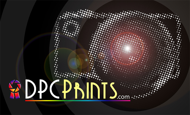
Like many entries, I think this could use one more line specifically explaining it\'s photographic prints for sale -- don\'t think it would be clear or enticing enough to \"outsiders.\" In fact, using a motif of what looks like halftone dots somewhat implies lithographic prints rather than photos. I like the overall design a lot, just question its suitability for this particular challenge...
Cool idea and nicely done. Because of shorter length of text this balances a little better than the dpchallenge version. I am definitely not keen on choice of font.
6, Kavey
Ok, I REALLY hate the R in this font. But otherwise I love the camera here and in the dpc challenge art. I like the ribbon's strange colors - but it doesn't tell anything about the site. Who would be motivated to come?
I'm not sure about the choice of font. I don't think the R is very clear. I like the rest of the design tho, except that the dotted camera may look a little too busy.








 Add photograph to your favorites
 Add photographer to your favorites


 Photographer found comment helpful.


